Overview
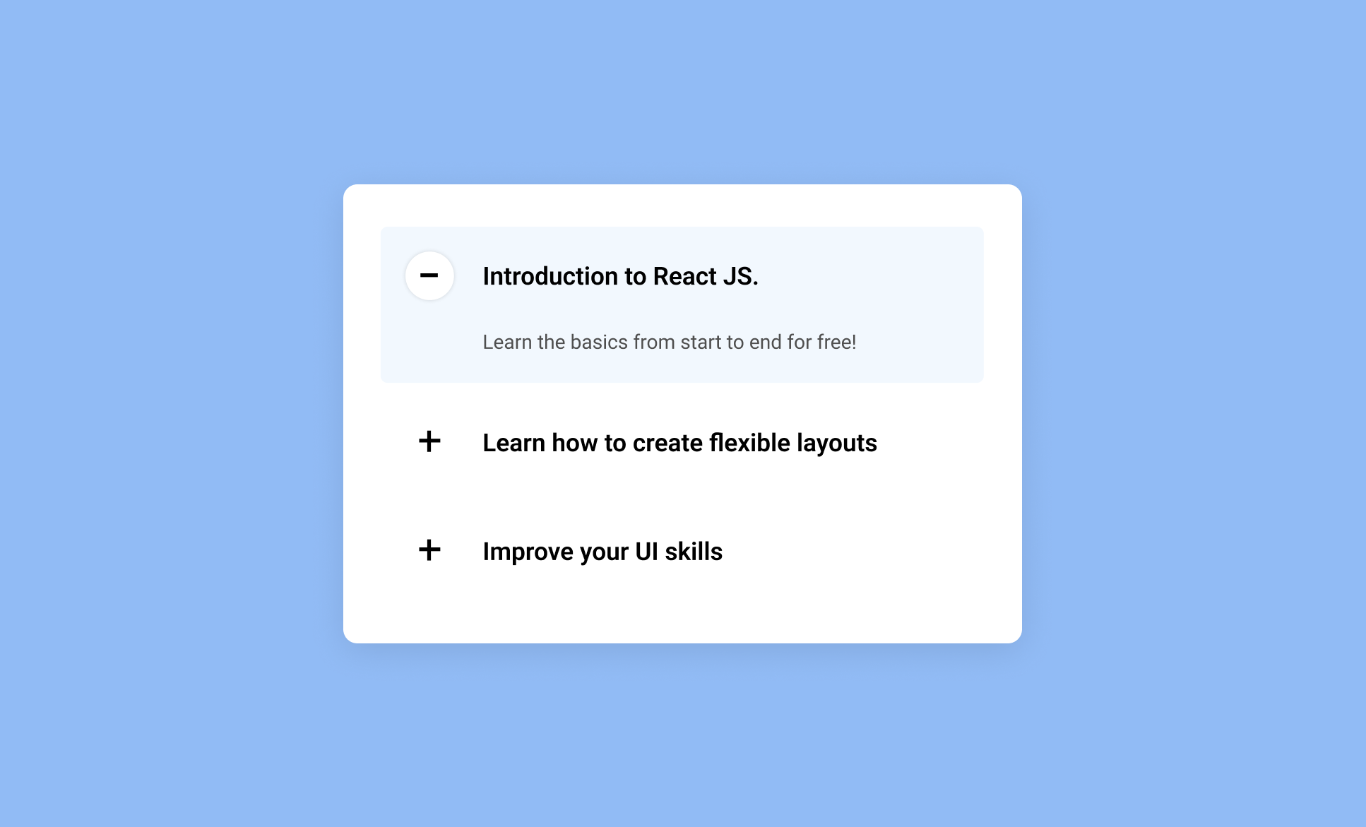
This tutorial shows you how to build a fully interactive accordion component from scratch in React, using state driven logic to control open and close behaviour, smooth CSS transitions and animated icon changes for a polished user experience.
You'll learn how to set up a React project, structure reusable components for the accordion container and individual items, style both default and active states, and use props to make each section dynamically reusable. The tutorial also demonstrates how to manage active state with useState and create a CSS based plus to minus icon animation, resulting in a clean, flexible UI pattern that reinforces core React concepts used across most interactive components.